Product Listings Page Design
Designed a structured Product List Page, Catalog Page, and Information Architecture with a hierarchical layout and filtering system, ensuring easy navigation, user trust, and improved profitability.

Role:
Product Designer
Client:
PodConverge
Category:
E-commerce, SaaS
Year:
2024
Overview
In the competitive world of print-on-demand, creators and small businesses struggle to compare products and maximize profits across multiple platforms. PodConverge simplifies this by unifying all major providers into a single platform, serving over a million users.
High level goals:
1. Building trust through a consistent, reliable experience.
2. Empower users with more control and informed decision-making.
3. Simplify product discovery to boost conversions and basket-building.
My Role
I led the end-to-end design process while collaborating closely with the Founder/Project Manager and the developer.
Key Deliverables:
-
Developed a clear taxonomy and information architecture for intuitive product organization.
-
Designed the Product List Page (PLP), Catalog Page, and Product Cards to enhance product discovery.
The web app is now in development and set to launch in April 2025.
Accomplishment
30% reduction in user navigation time.
+4 new features for the Product List Page based on user needs and business goal.
Design Overview
Initial design

After user testing

Quick overview of my initial product navigation design and the final iteration after user testing and feedback.
Client's request
"Design an intuitive shopping experience that builds trust, simplifies product discovery, and remains scalable for future growth."
CEO
Keivan Khaleghi
Finding Our Advantage
Before diving into the research phase, I focused on understanding PodConverge’s value proposition to ensure my work aligned with the company’s mission and competitive edge.
For instance, I identified three key strengths that make PodConverge unique:
-
A wider product selection.
-
Sustainable product options.
-
The lowest prices and shopping costs.

Three key strengths that make PodConverge unique and position it to stand out in this project.
Customer Insights
Through interviews and research, I aimed to find out about what do users want to achieve? What do they expect? Or how users typically think about accomplishing some steps, based on their experience with similar platforms to uncovered pain points faced by users of current print-on-demand platforms.

The discovery phase was a quick, high‐intensity effort that allowed me to define project milestones, review the competitor landscape, understand client's vision.
"In avarage 58% of shoppers leave e-commerce websites due to poor experience."
User groups driving the design
To ensure the design caters to PodConverge’s diverse audience, I identified four key user groups. By understanding their unique goals and challenges, I was able to create a more targeted and efficient Product List Page (PLP) and Information Architecture (IA).
Below are the core groups that shaped the design:

Profit-Focused Creators
Prioritize maximizing profit margins.

Eco-Conscious Sellers
Seek sustainable product options.

Quality Enthusiasts
Demand high-quality prints to maintain customer satisfaction.

Eco-Conscious Sellers
Need variety and scalability for business growth.
Understanding the distinct needs of the key user groups, I shifted my focus to defining the core challenges that needed to be solved. To address these challenges effectively, I framed the design process around "How Might We" questions. For example, one of the key questions was:
"How might we make a product comparison easier for users to help them make confident decisions?"
With the "How Might We" questions guiding my approach, I broke down each user group’s goals and pain points. To ensure the design was truly meeting their needs, I mapped these insights to how the Product List Page (PLP) and Information Architecture (IA) would address them, referring back to them throughout the design process.

Summarize the user types, their pain points and how to address those
Building an Expandable Foundation
Organizing the Information Architecture (IA) was essential to creating a smooth and intuitive browsing experience. With products from multiple providers, the challenge was finding a structure that made everything easy to navigate while remaining flexible for future growth. The categories and subcategories needed to be broad enough to allow expansion yet clear enough for effortless product discovery.
To ensure the system made sense, I tested it with four users, using their feedback to refine the structure and make navigation as seamless as possible.

Due to the extensive scope of the Information Architecture, this only the Men's category as a reference.
PodConverge has its own design system. I followed this framework closely also expanding components where necessary.
Shaping an Easy Exploration Path
With a diverse range of products to showcase, I first focused on building a navigation system that would make it easy for users to explore. My initial approach included a breadcrumb bar at the top and a clickable flash navigation at the bottom to reveal more options. However, during the first round of testing, it became apparent that users struggled to get a full view of the available products.
To address this, I streamlined the category titles and introduced a ‘View All’ option in the navigation bar. This adjustment allowed users to quickly access and see the entire catalog, making it much easier to explore all the product categories.

Beneath the ‘View All’ option, I added product cards that included both images and titles. This visual approach helped users quickly understand and navigate through the options, streamlining the browsing experience.

Product List Page (PLP)
The Product List Page (PLP) is the heart of the PodConverge platform, and it plays a critical role in the success of the entire project. As I sketched and explored different ideas until I came up with the final design, I made sure to keep the unique needs of our users at the forefront of my design process, ensuring that every decision was made with their needs in mind.

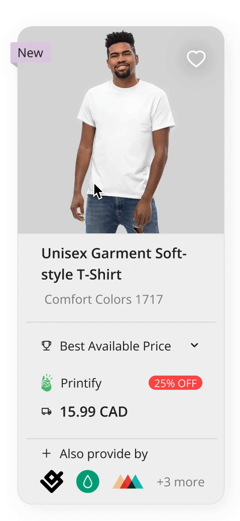
Product card design
For the product card, I used color coded label to make it more recognizable on a glance. In addition to improve usability, based on user feedback.
I also introduced new features, options like ‘Best Available Price’ and ‘Best Available Shipping Price’ to the product cards. These features empowered users to make more informed decisions and added value to their shopping experience.

Seeing It in Action
To quickly improve my design, I conducted user testing with three participants, asking them to complete specific tasks while observing their behaviors and challenges.
Based on their feedback, I made several key adjustments to enhance the user experience:
-
Clearing filter selections was difficult in the original design, so I added a "Clear All" option and close buttons for each filter, simplifying the process.
-
To improve accessibility, I placed product quantity details at the top of the page, making this information easier to find.
Before

After

3. Users wanted a faster way to view product details, so I added a hover feature that shows more images of the product, offering a clearer view without needing to navigate to a separate page.
Before

After
Lessons to Learn
One of the key things I learned during this project is the importance of continuous user feedback. Testing the design early and often helped me uncover pain points I hadn’t anticipated, such as the need for a clearer view of product variations and the ease of unselecting filters.
I learned how valuable it is to be flexible in the design process. While I started with certain ideas, being open to iterating based on user needs allowed me to refine the design to meet user needs effectively.
The Launch is Just the Beginning
The web app is now in the development and is scheduled to launch in November 2025.