


THE AFRICA IN ME
Enhancing Usability
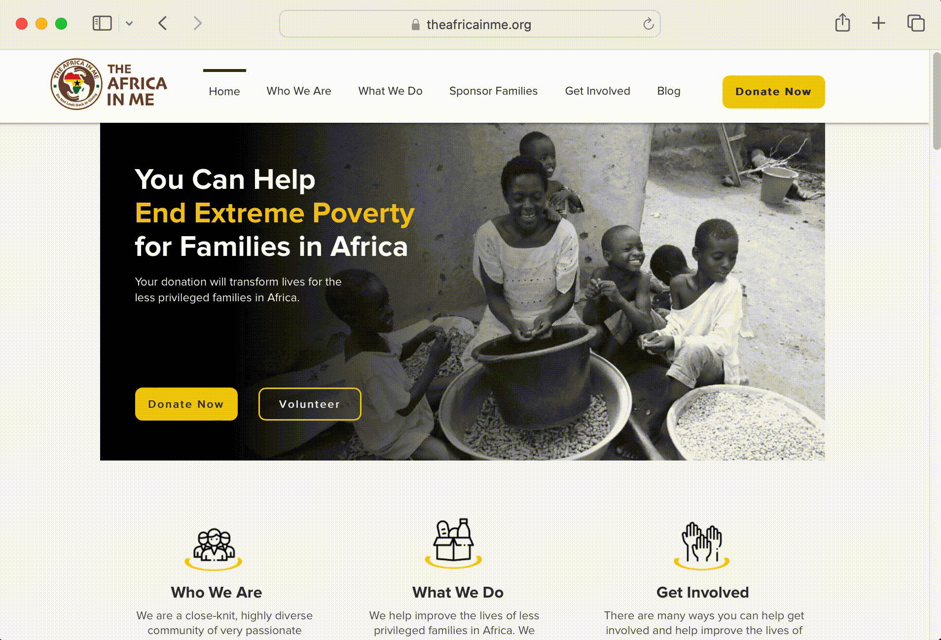
The Africa In Me (AF. IM) is a non-profit organization dedicated to serve and bring relief to the less fortunate families.
Website:
Role:
UX Designer & Researcher
Client:
The Africa in Me
Category:
Web Design
Duration:
1 Week
Year:
2023
Challenge
Identify user pain points to increase donation rates.
Solutions
Enhanced usability by narrowing down the top banner of each page, allowing users to engage with all content on the website.

Methodology
Summative evaluation
To understand user behavior, I conducted a survey involving five participants. The survey was created using Google Forms. Additionally, I monitored two participants to observe their interactions and user behavior while using the website. My main objective was to study how users engaged with the website interface and if they had any difficulties with navigating the website.
01
Main research objectives
-
Exploration of Website:
Users were directed to navigate through the Africa In Me website and explore its pages to find specific information or complete designated tasks. For instance, one task involved locating a family to sponsor.
-
Overall User Experience:
I asked the participants about the website's overall feel, alignment with the organization's mission, and relevance of the provided content.
02
Findings
Upon analyzing the user interactions and survey responses, I identified a key issue:
Two out of five users did not realize that some pages contained additional content beyond what was immediately visible.
03
Key insights
-
Limited Understanding of Page Depth:
Some users may not be aware of the website's scrollability, leading to a lack of exploration beyond the initial content visible on the screen.
-
Incomplete Perception of Page Context:
Some users may fail to grasp the entirety of the context available on the page, causing potential misunderstanding or incomplete information absorption.
04
Recommendations
Based on our observations and insights gained, I proposed two recommendations to enhance the user experience of The Africa In Me website. In response to my research findings and recommendations, the team settled with the seconded proposed recommendation.
-
Visual Indicator for Scrolling:
Implement subtle visual indicators (such as arrows or animations) to encourage users to explore further content by scrolling down.
-
Narrower Banner Design:
Redesign banners on each page to be narrower, allowing users to preview the subsequent content and encourage them to scroll further.
05
Proposed design change
06
Takeaway
This study shed light on a major usability issue affecting user engagement with The Africa in Me website. By addressing the lack of understanding regarding page depth and context, and introducing narrower banners on each page, I have improved the user experience.